


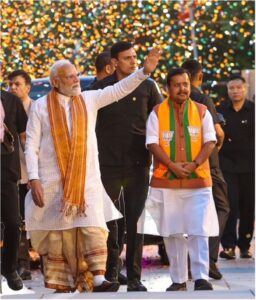
What Japan’s Next Prime Minister Means for Business
Context Fumio Kishida won the ruling Liberal Democratic Party (LDP) presidential election on September 29. …
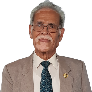
 Kiyoaki Aburaki


This is page is a showcase of each custom BowerGroupAsia block and instructions on how to use them.
This block is simply a container for other blocks. It allows you to pick an image for a background, and a color to overlay on top. If you just want a solid color background, ignore the image field and ensure the colors opacity is at 100%.
This example shows an image with a dark green overlay and some text blocks inside the container. The inner padding is provided by a Spacer block.

Lorem ipsum dolor sit amet, consectetur adipiscing elit. Nullam eu pellentesque odio. Vestibulum et libero eu odio tempor mattis nec sit amet mauris. Sed mauris ipsum, maximus non augue et, rhoncus bibendum felis.
Lorem ipsum dolor sit amet, consectetur adipiscing elit. Nullam eu pellentesque odio. Vestibulum et libero eu odio tempor mattis nec sit amet mauris. Sed mauris ipsum, maximus non augue et, rhoncus bibendum felis
Call to ActionThe button block has three settings. First, select the link, entering a URL, the button text, and whether to open in a new window.
Next choose your style. Each main theme color is available as a standard button, outlined button, or text with arrow.
Finally, you can choose to center the button.
The default is one button per row as shown here.
Green Blue Outline Magenta CenteredTo display multiple buttons inline, wrap them in a Button Group block. You can also set the group to be centered.
The Case Study Header is only available on the Case Studies single posts so it cannot be shown here. You can select a background color and choose to use light or dark text. It comes populated with a heading, text, breadcrumbs, and a tag to display the Case Study Industry.
This is also only available on the Case Studies single posts. It will display a link to the case studies Industry taxonomy archive.
This block will keep the content contained in a centered column. You can give it a background color and select white or dark text. If there is a background color selected, top and bottom padding will be added.
Lorem ipsum dolor sit amet, consectetur adipiscing elit. Duis accumsan, diam ornare molestie feugiat, lectus diam hendrerit magna, sit amet malesuada purus velit eget ipsum. Morbi sit amet mauris eget justo pulvinar cursus. Phasellus et turpis nec odio ultricies aliquam. Mauris nec libero arcu. Nam felis mi, tempus nec mollis non, ullamcorper ac leo. Etiam eu orci elit. Quisque non consequat metus. Cras placerat sapien ut augue.

Lorem ipsum dolor sit amet, consectetur adipiscing elit. Duis accumsan, diam ornare molestie feugiat, lectus diam hendrerit magna, sit amet malesuada purus velit eget ipsum. Morbi sit amet mauris eget justo pulvinar cursus. Phasellus et turpis nec odio ultricies aliquam. Mauris nec libero arcu. Nam felis mi, tempus nec mollis non, ullamcorper ac leo. Etiam eu orci elit. Quisque non consequat metus. Cras placerat sapien ut augue.
Call to ActionThis block will showcase a Featured Case Study. By default it will show the Case Study post title and excerpt, but you can optionally add your own title and text if you wish.

Lorem ipsum dolor sit amet, consectetur adipiscing elit. Nullam eu pellentesque odio. Vestibulum et libero …
View Case StudyEach block will always have a side image, a top section with heading and text, and a bottom section with a call to action to read the Featured Case Study.
You can select a random post or choose a specific link. You can also give each half it’s own background color. By default, there is no top padding on the top half. If using a colored background, add a Space block above the title.
For best display, you’ll want to use a landscape orientated image.
A Space Block was added above this title.
This Text is Manually Entered
This block doubles as a common theme Page Header which can be found in the BGA Patterns section of the post editor.
You can select up to three images, choose which side is text, give the content area a background color, and even choose how wide you’d like the image.
Nulla congue nisi at efficitur molestie. Duis arcu sem, efficitur ac ante eget, mattis viverra ligula. Praesent a tellus ac ex vulputate posuere. Suspendisse molestie elit non leo rhoncus efficitur. Mauris convallis, leo sit amet aliquet elementum, erat eros egestas mi, a fermentum nulla urna sit amet metus.
Go Somewhere
Nulla congue nisi at efficitur molestie. Duis arcu sem, efficitur ac ante eget, mattis viverra ligula. Praesent a tellus ac ex vulputate posuere.
Go Somewhere
About BowerGroupAsia
Lorem ipsum dolor sit amet, consectetur adipiscing elit. Nullam eu pellentesque odio. Vestibulum et libero eu odio tempor mattis nec sit amet mauris. Sed mauris ipsum, maximus non augue et, rhoncus bibendum felis.
This will display a list of all child pages of the main Solutions > Industries page. There are no settings for this block.
A page header designed specifically for the Leadership page. It will come populated with breadcrumbs, a top title, heading, paragraph, and CTA button. You will have to select the featured Team Member.
Our Leadership
Lorem ipsum dolor sit amet, consectetur adipiscing elit. Nullam eu pellentesque odio. Vestibulum et libero eu odio tempor mattis nec sit amet mauris. Sed mauris ipsum, maximus non augue et, rhoncus bibendum felis.
Call to Action
This will show a gallery of all Team Members tagged as leadership. You can choose to exclude a Team Member as well, so that you aren’t repeating the person featured in the Leadership Header.

President & CEO

Chief Operating Officer

Chief Strategy Officer

Senior Advisor

Senior Advisor

Senior Advisor

Managing Director

Senior Advisor
Senior Advisor

Senior Advisor

Managing Director

Managing Director

Deputy Managing Director

Managing Director

Senior Advisor

Managing Director

Managing Director, Global Trade and Economics

Senior Advisor

Managing Director

Managing Director

Senior Advisor

Senior Advisor

Head of Asia Office Management

Head of HR, Talent & Training

Head of Research
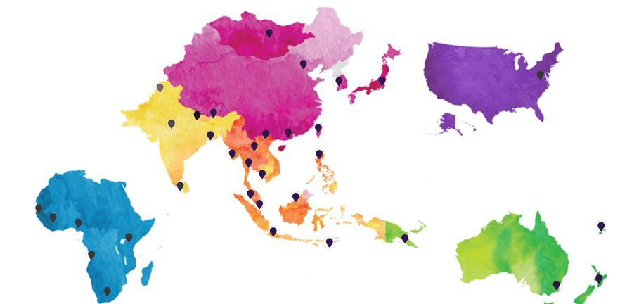
This will show two tabs, one for Locations by Country and one for by Region. There are no settings for this block.
 Angola
 Australia
 Bangladesh
 Bhutan
 Brunei
 Cambodia
 China
China
 Côte d’Ivoire
 Fiji
Fiji
 Hong Kong
 India
India
 Indonesia
 Japan
Japan
 Kenya
Kenya
 Korea
Korea
 Laos
Laos
 Malaysia
 Mongolia
 Myanmar
 Nepal
Nepal
 New Zealand
 Nigeria
 Pakistan
 Papua New Guinea
 Philippines
 Senegal
 Singapore
 South Africa
 Sri Lanka
 Taiwan
 Thailand
 Timor-Leste
 United States
 Vietnam
 Operations
United States
Operations
Brunei
Cambodia
Indonesia
Laos
Malaysia
Myanmar
Philippines
Singapore
Thailand
Timor-Leste
Vietnam
Bangladesh
Bhutan
India
Nepal
Pakistan
Sri Lanka
Australia
Fiji
New Zealand
Papua New Guinea
China
Hong Kong
Japan
Korea
Mongolia
Taiwan
Angola
Côte d’Ivoire
Kenya
Nigeria
Senegal
South Africa
Operations
United States
Operations
Brunei
Cambodia
Indonesia
Laos
Malaysia
Myanmar
Philippines
Singapore
Thailand
Timor-Leste
Vietnam
Bangladesh
Bhutan
India
Nepal
Pakistan
Sri Lanka
Australia
Fiji
New Zealand
Papua New Guinea
China
Hong Kong
Japan
Korea
Mongolia
Taiwan
Angola
Côte d’Ivoire
Kenya
Nigeria
Senegal
South Africa
This block is currently used only the Contact Us page but could be used anywhere. There is no content or settings to add to this block.
This block is pre populated with the image below, but you could add your own if you choose. By default, the heading is slightly larger than most H2’s and set to green, though you can set a different color in the editor.
Add your own text here.
If used, this block should be first on your page. It provides a full image background, and you can add a title, text, breadcrumbs, and buttons. By default, the content will be in the lower left, but you can also set it to center. Breadcrumbs are also included by default, you can delete them in the editor if they are undesired.
Lorem ipsum dolor sit amet, consectetur adipiscing elit. Duis accumsan, diam ornare molestie feugiat.
The rainbow bar is simply a 10px high decorative divider. It can be set to full width (default), wide width, or center width.
The Recent Items block will show three Insights & News posts based on your selected category. The heading is generated dynamically based on your selection, and you can also add optional text if you like.
This is one of the only blocks to have padding added by default, but you can choose to remove the section padding if you like. You can also remove the header entirely. Finally, a background color can be given to this block as well.
If you select the option, “Sticky Article”, it will show just one item, the News Item you’ve tagged as “sticky” that is your featured article. The example below is for the category “Reports”
Context Fumio Kishida won the ruling Liberal Democratic Party (LDP) presidential election on September 29. …
Kiyoaki Aburaki
This will display a list of all child pages of the main Solutions > Services page. There are no settings for this block.

Equipping organizations to proactively mitigate risks and handle unforeseen disruptions.
Read More
Helping businesses to ensure their voices are heard by the decision makers that matter.
Read More
Helping leading companies understand and shape the enabling environment around which policies are made to inform decision points.
Read More
Equipping companies with the expertise and support to select, plan and execute strategies to operate in Asia’s diverse array of countries.
Read More
Positioning the world’s leading firms to know Asia’s influencers and how to interact with them for success.
Read More
Positioning the globe’s leading companies to manage intersecting, multifaceted risks throughout their operations in Asia’s complex geopolitical landscape.
Read MoreThe Simple CTA block provides only a few options. You can set a background color, change text alignment between left or center, and add up to two links. Links will always appear as white outline buttons, so light colored backgrounds are not recommended.
This block is designed for the homepage header, so it will always be 100% of the viewport height. It could be used elsewhere if desired but there are currently no options to reduce height so the sites navbar will always sit on top.
Slides can be images or video, and it will include a bottom navigation area.
There are just a couple of setting for this block. First, you’ll want to add a short blurb for the heading text and a call to action. Then, you’ll need to add an image and provide for the small textarea underneath. The title is just a standard Heading block so you can set a different color for it if you like.
A short area for header text. Call to Action
Another short text area is provided here. Call to Action
The majority of the custom BowerGroupGroup blocks contain no top and bottom padding. This is to allow for their use in any situation without causing unwanted gaps if you want elements closer or farther apart.
WordPress has a native Spacer block that you will use much more often than this. However, it is not responsive so this block is an alternative should you need to adjust spacings for different browser sizes.
This block only uses REM units which is equal to 16px in most browsers. There are six sizes to add when using this block, so for example, if you want a lot space between elements on a desktop computer, but little or no space between those same elements on a mobile device you could set the first three sizes (xs, sm, md) to 0, 1, and 2 respectively, and the next three (lg, xl, xxl) to 6.
The Squares block has a few options, the biggest being that it can be used a slider. If using more than four slides you’ll likely want to enable that option, but squares will wrap onto a new row otherwise. Slider’s will look best with the Squares block set to full width alignment.
You can also give the titles a color which will add a little decorative divider, and you can also offset each square. When using offset squares in a slider, it’s recommended to use an even number of slides. Otherwise as the slides loop back around there will be a funky little layout shift.
Lorem ipsum dolor sit amet, consectetur adipiscing elit. Nullam eu pellentesque odio. Vestibulum et libero eu odio tempor mattis nec sit amet mauris. Sed mauris ipsum, maximus non augue et, rhoncus bibendum felis.
Lorem ipsum dolor sit amet, consectetur adipiscing elit. Nullam eu pellentesque odio. Vestibulum et libero eu odio tempor mattis nec sit amet mauris.
Call to ActionLorem ipsum dolor sit amet, consectetur adipiscing elit. Nullam eu pellentesque odio. Vestibulum et libero eu odio tempor mattis nec sit amet mauris. Sed mauris ipsum, maximus non augue et, rhoncus bibendum felis.
Lorem ipsum dolor sit amet, consectetur adipiscing elit. Nullam eu pellentesque odio. Vestibulum et libero eu odio tempor mattis nec sit amet mauris. Sed mauris ipsum, maximus non.
The Stat Counter can accept up to four stats. You can choose a color, and for each stat you can choose to prepend a plus sign or add a Call to Action.
You are also given an option for “Large” or “Small” stats. Using the small option will stack the stats and allow the block to fit on a row with additional content. Use the “Content and Stats” Block Pattern when you want to use this option.
Lorem ipsum dolor sit amet, consectetur adipiscing elit. Nullam eu pellentesque odio.
Lorem ipsum dolor sit amet, consectetur adipiscing elit. Call to Action
Lorem ipsum dolor sit amet, consectetur adipiscing elit.
Lorem ipsum dolor sit amet, consectetur adipiscing elit. Nullam eu pellentesque odio. Vestibulum et libero eu odio tempor mattis nec sit amet mauris. Sed mauris ipsum, maximus non augue et, rhoncus bibendum felis. Lorem ipsum dolor sit amet, consectetur adipiscing elit. Sed mauris ipsum, maximus non augue et, rhoncus bibendum felis. Lorem ipsum dolor sit amet, consectetur adipiscing elit.
Lorem ipsum dolor sit amet, consectetur adipiscing elit nam eget augue nec ligula feugiat facilisis lorem ipsum.
Lorem ipsum dolor sit amet, consectetur adipiscing elit nam eget augue nec ligula feugiat. A Link
Lorem ipsum dolor sit amet, consectetur adipiscing elit nam.
The Team Directory will show a complete list of all Team Members filterable by name or location. There are no settings for this block. It’s also very long so will not be shown here.
The basic Testimonial block doesn’t have any options.

What differentiates BGA is the quality, breadth and depth of our country-based experts who skillfully advise clients on 28 markets across the region. Our sole focus and center of gravity is Asia, and our services span from high-level strategic guidance to granular in-country support.
This block is similar to the Stat Counter Block Pattern, it’s designed for a testimonial to be featured on the same row as additional content.
You can choose if you want the content on the left or right side, and you can also spruce up your testimonial by changing its style to one with an image. The testimonial background and text colors can be set with this option.
Lorem ipsum dolor sit amet, consectetur adipiscing elit. Nullam eu pellentesque odio. Vestibulum et libero eu odio tempor mattis nec sit amet mauris. Sed mauris ipsum, maximus non augue et, rhoncus bibendum felis.
What differentiates BGA is the quality, breadth and depth of our country-based experts who skillfully advise clients on 28 markets across the region. Our sole focus and center of gravity is Asia, and our services span from high-level strategic guidance to granular in-country support.
Lorem ipsum dolor sit amet, consectetur adipiscing elit. Nullam eu pellentesque odio. Vestibulum et libero eu odio tempor mattis nec sit amet mauris. Sed mauris ipsum, maximus non augue et, rhoncus bibendum felis.
Lorem ipsum dolor sit amet, consectetur adipiscing elit. Nullam eu pellentesque odio. Vestibulum et libero eu odio tempor mattis nec sit amet mauris. Sed mauris ipsum, maximus non augue et, rhoncus bibendum felis.

What differentiates BGA is the quality, breadth and depth of our country-based experts who skillfully advise clients on 28 markets across the region. Our sole focus and center of gravity is Asia, and our services span from high-level strategic guidance to granular in-country support. Ernie Bower BGA President & CEO
There are no options for this block, you simply add slides picking the testimonial and accompanying image.
This is a Top Title
The Top Title block is a small piece of text designed to be placed above headings. You can control it’s color, font weight, and alignment.
This block will search the page for all Top Titles and create a navigation menu for them to link within the page. Contextually, it should probably only be used at the top of the page beneath a Page Header block.
It will grab the full text of the title, so when using this, it’s recommended to use short and to the point titles (“Our Work”, “About Us”, etc).